Typography
Although we've covered some basic ideas about type in earlier lessons, now we're going to start studying type more carefully
Start by watching the movie Helvetica. It provides a good background about the way typographers think, and about one of the most important fonts of the modern era.
Next, we'll start just looking at type more closely. First take the time to read more about fonts by looking at the font links on my links page.They explain some of the basics of type, and typographic terms.
Next read this page about common fonts, and try your hand at the rather difficult font game.
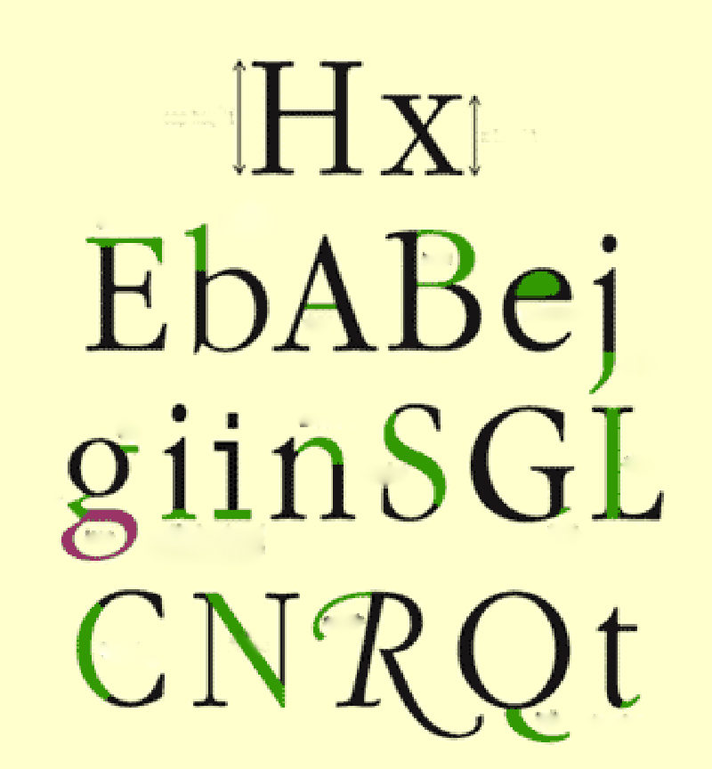
Lesson 1-Anatomy of Type
Print and complete the worksheet by identifying all the green areas.
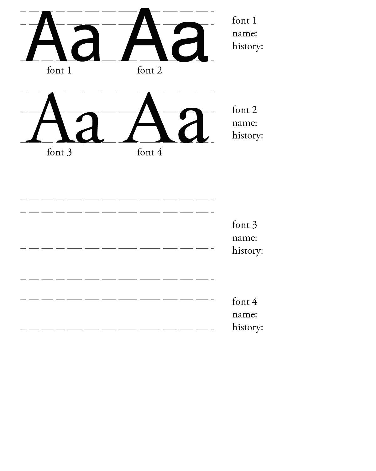
Lesson 2- The Letter "A"
Using a sharp #2 pencil (and an eraser!), draw from observation only (no tracing!!) and match the letter forms as exactly as you can. Take your time, and get it just right-look at the proportions of height versus width, thin and thick strokes, angles, etc. Clean up the lines, so your drawings are nice and neat. Scan your drawing, and put it beside the original. You can adjust the size, but NOT THE PROPORTIONS (shift-drag to keep proportions)!!! Then, figure out what fonts you drew, and label them. Check out the links to various font identifiers.
What you need to do
Print both worksheets.
Identify the anatomical structures of the letters on the first worksheet.
On the second worksheet, draw the letter A to match the various fonts. Use a sharp pencil and an eraser. You may go over your pencil drawing with ink if you like, but it's not necessary.
Identify the four fonts represented by the letter A.
What you need to turn in:
Both completed worksheets.
What I will be grading:
You will get credit for submitting each correctly completed worksheet on time.