Logo and Identity
Before going any further, read some of these blogs/websites.
Logo design involves a lot of concepts, including some basic technical and formal issues that are pretty clearly defined, as well as conceptual concerns that are harder to nail down. For this lesson, we will start with the simplest of logos, and try and cover the technical and formal issues. At the end of the lesson, you will have a simple personal logo which you can use on all your promotional and personal correspondence. You will also be required to create a logo for a real or imaginary company.
Part One: Examine existing logos
What you need to do:
To start with, spend some time collecting logos. Scan or download a variety of logos that appeal to you, in color or black and white, and arrange them in a row in a word document. Save your finished worksheet as "LogoWS_astudent.doc".
Next, print out your three favorite logos, and draw them with a pencil. Note how the shapes fit together, how the letter forms are connected, etc.
What you need to turn in:
"LogoWS_astudent.doc".
What I will be grading:
You will receive credit for turning in your correctly completed worksheet on time.
Part Two: Drawing logos on paper
Using a pencil and paper, draw some possible solutions for your personal logo.
Remember the golden rule of logo design:
LESS IS MORE
It's almost impossible to make your logo TOO simple. Take a look at this logo for the tech company NVIDIA.

This is pretty simple, but a few years ago, the company went to a lot of trouble and expense to make it simpler. This is what they came up with:

Often, they only use half of this, like this:
![]()
You need to be thinking along these lines as well. It's easier to embellish a simple shape than it is to simplify a complicated one. Some of the simplest solutions to your logo problem might be to combine your name or a part of your name with just a line, a simple shape or a combination of a few shapes. If your name is Jimmie Jaffers, a simple solution might be something like this:

Especially if you sell umbrellas!
What you need to do:
Draw at least ten different ideas for logos.
What you need to turn in:
Ten logos, drawn with pencil on paper.
What I will be grading:
You will receive credit for turning in your ten hand-drawn logos. Although some variations on a theme are fine, don't make all ten variations on one theme.
Part Three: Designing a vector graphic
When you get to the computer, you'll need to spend a little time learning how Illustrator handles text and shapes. Although every shape has a stroke and a fill color, for this design, you should limit yourself to either:
a stroke and no fill, for shapes like this:

0r a fill and no stroke for shapes like this: (Illustrator makes type with a fill and no stroke by default).

Remember the golden rule of logo design:
LESS IS MORE
The most common mistake beginners make when designing logos is to make the logo too complicated.
Color and Black/White
Your logo needs to work in both color and black and white. The easiest way to achieve this goal is to design the logo in black and white first, then start thinking about color.
This logo is fine in color:

But in Grayscale, it's not so good.

And it's impossible to make a black and white version without any grays, unless you do something like this:

Of course, this is possible, but it's often easier to start with black and white and go towards color.
Remember, for more ideas about branding and logo design, check out the links under "logos" on the links page.
What you need to do:
Make three different personal/professional logos on the computer, each one in black and white and in color.
Save the file as "3logos_astudent.jpg"
What you need to turn in:
3logos_astudent.jpg
What I will be grading:
You will receive credit for turning in your correctly completed logos on time.
Part Four: Using the logo
With the assistance of your class and instructor, select one logo as your final choice. You may choose to make some minor modifications to the logo at this point. Discard the other two. Then use the logo to design a letterhead, business card and envelope. You will need to think about fonts, decorations, color schemes and variations of the logo to accomplish this.
Type is extremely expressive, and the fonts you choose say a lot about you, whether you meant to say that or not. Choose carefully, and remember that LESS IS MORE!
Because your logo did not contain your full name, address, email, and telephone, you'll need to add these. Use your real contact info, don't just make stuff up. It seems obvious to state this, but I have had students turn in business cards without their name and phone number on them. Don't make this obvious mistake. Do I need to remind you to spell check? Nothing says "amateur" like misspelling your state, city, or (God forbid!) your own name. I've seen it happen.
Finally, you will make a comp, that includes your logo in black and white and color, as well as the letterhead, business card and envelope, all in one image. Save this image as "Logo_astudent.jpg".
What you need to do:
Select and edit your favorite logo.
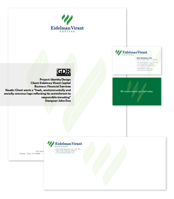
Combine all your logo/identity design into a single file that contains the following:
Your logo in color
Your business card, using the logo
Your letterhead, using the logo
Your envelope, using the logo
A description of the logo and client
Name this file "Logo_astudent.jpg". It should look something like this:
What you need to turn in:
"Logo_astudent.jpg". This will be a file that has the complete comp on it, with the letterhead, envelope and business card, as well as the logo itself. You will also have text on this file explaining the client, and its needs. Your logo, as the designer, will be in the corner.
What I will be grading:
Technical Outcomes: Design will demonstrate student’s ability to use Illustrator to make logos and identity design, and to present a finished comp. There will be no typos, misspellings or other mistakes in the type.
Formal Outcomes: Logo is clean and simple and reproduces well in a variety of sizes and in black/white and grayscale. Comp is arranged cleanly and simply, with adequate text to describe the project. Treatments of the logo and typography are consistent across the comp.
Conceptual Outcomes: Logo design and typography are appropriate to client.

