Guide to Common Fonts
These are just a few of the most common fonts you will encounter when working with type. Start by looking at all of these and start thinking about how to distinguish them. Each image links to more information.
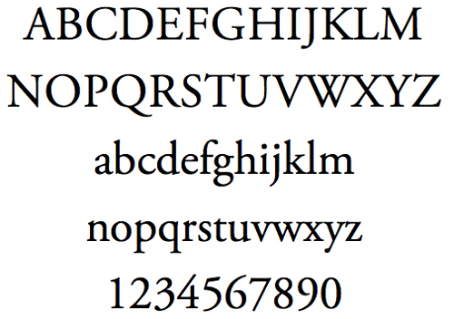
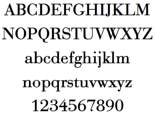
Times New Roman
This is the most common font on earth. It's a medium weight serif font.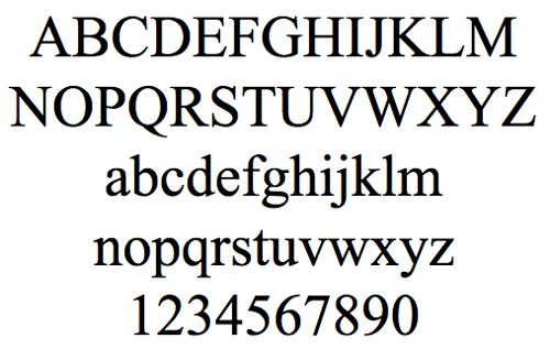
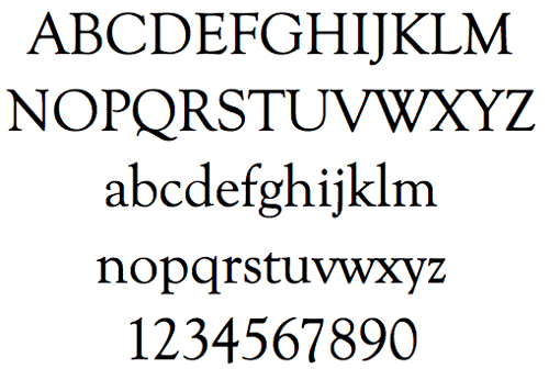
Goudy Oldstyle
Notable for the upward ear of the lower-case g and the shape of the dots.
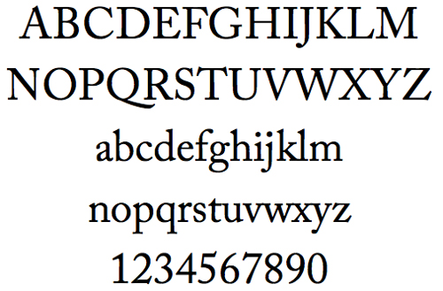
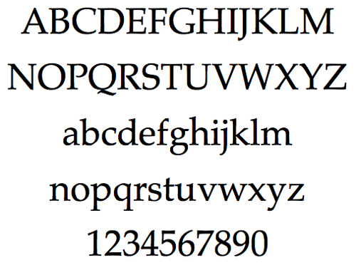
Adobe Caslon Pro
A newer version of Caslon. Note the "scooped" top of the A, and the differences in the Q and the ears of the g.
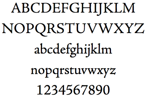
Adobe Jenson
Note the low x-height and the slope of e's bar.
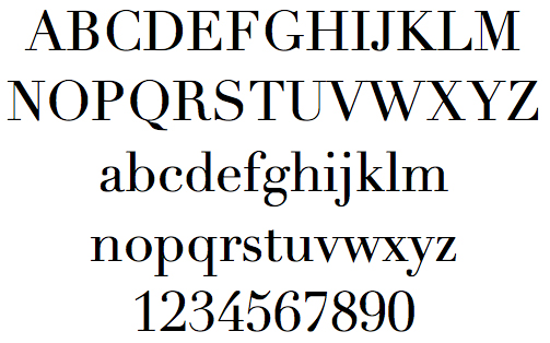
Adobe Garamond Pro
Notice the small bowl of the a and the small eye of the e. Long extenders and top serifs have a downward slope.
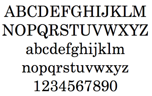
Century
A common font for reading textbooks in the early part of the 20th century. Often called Century Schoolbook. Note the looping Q.
Palatino
A very popular font, its calligraphic nature mimics the use of a broad nib pen.
Didot
High contrast between thin and thick strokes, angular and very thin serifs
Bodoni
Another example of extreme contrast between thick and thin strokes, but not quite as extreme as Didot.
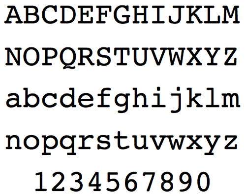
Courier
A monospaced, slab serif (rounded), commonly used in screenplays and government work. One of the most common of the truly ugly typefaces.
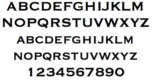
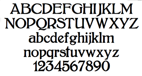
Copperplate
Distinctive pointy serifs, especially on the numbers.
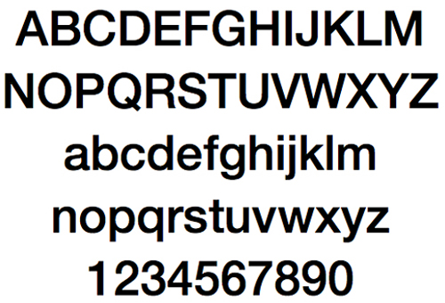
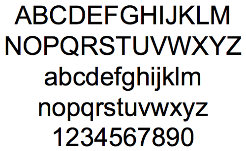
Helvetica
The most common sans-serif font ever, it's either the pinnacle of typographic design or an abomination of Nature. Opinions vary.
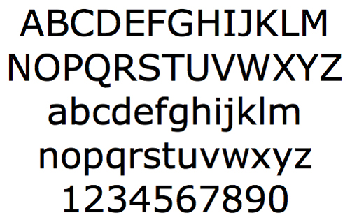
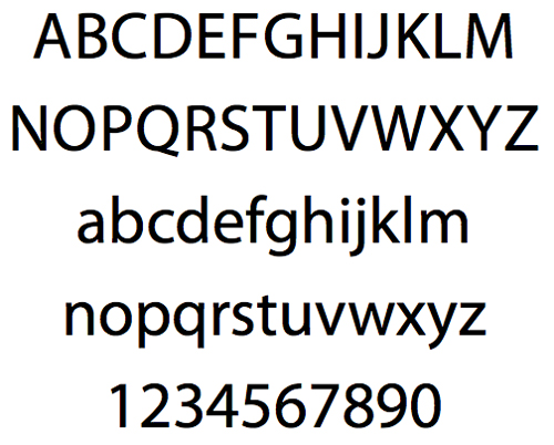
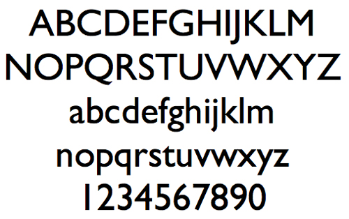
Verdana
Commisioned by Microsoft to work on the web, althought it's often used in print as well. Very common-this page uses Verdana as its body type.
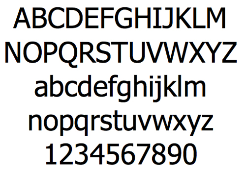
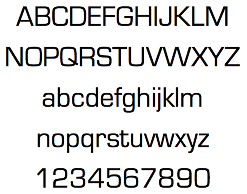
Tahoma
Another Microsoft font, Tahoma is extremely similar to Verdana, but has a narrower body, less generous counters, and tighter letter spacing.
Geneva
Another Helvetica follower, Geneva was developed by Mac, and has rounder bowls, and is lighter than Helvetica. Noet that the tail of the y is much more like Helvitica than Tahoma or Verdana.
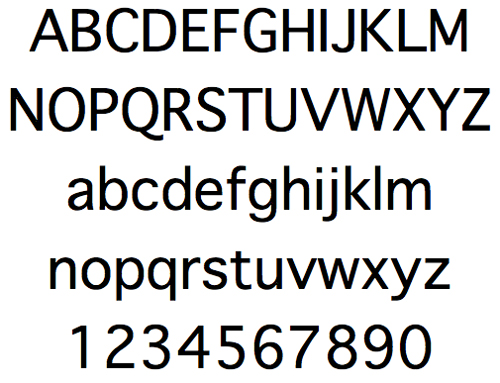
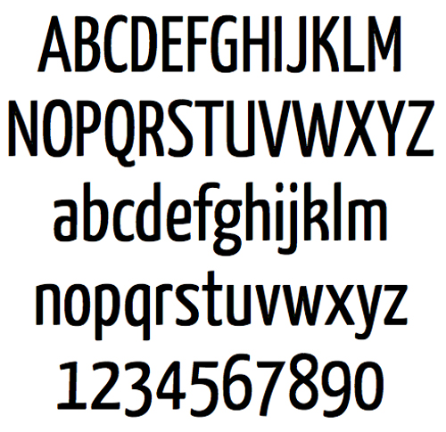
Arial
Another font that is similar to Helvetica, but with a straight legged R.
Myriad Pro
Developed by Adobe. Distinct Q.
Century Gothic
Geometric, based on Futura. Note the a and the 1.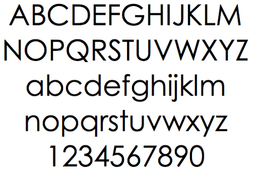
Impact
Similar to Haettenschweiler, it's just what it sounds like-a big sturdy font designed for headlines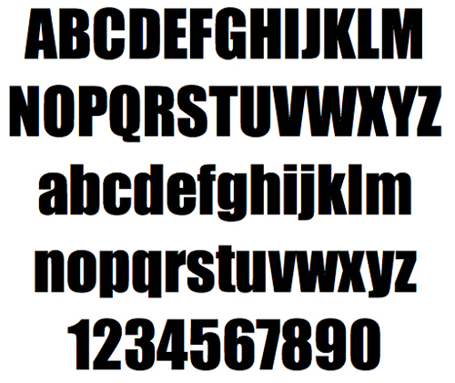
Eurostyle
Modern and sleek.
Gill Sans
A more old-fashioned sans-serif, with a bit of class and elegance. The g is very different from all the above examples.
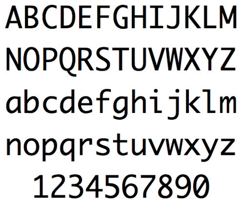
Monaco
A mac font that serves as a default for many Snow Leopard functions. Monospaced, and built to distinguish between | and l, and 1, and between 0 and O. Not quite as ugly as Courier.
Bolton
Old fashioned-"recalls a time when everyday objects had grace and charm".
Yanone Kafeesatz
A truly cool named font, inspired by too much time in coffee shops.
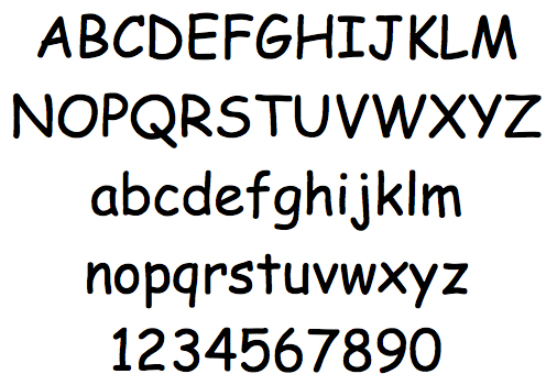
Comic Sans
Most-loved font by people that don't love fonts. Popularized by Beanie Babies.
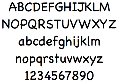
Chalkboard
The Mac version of Comic Sans. Slightly neater, more vertical, but just as ugly.
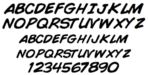
Comic Book
A much better alternative. Actually looks like it came from a comic, rather than just being a joke. Unfortunately, no lowercase letters.
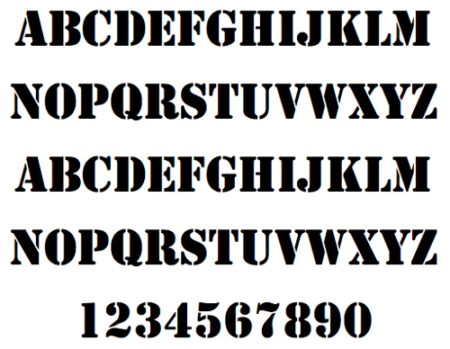
Stencil
Just what it sounds like, just what it looks like. Lots of variations on this one.
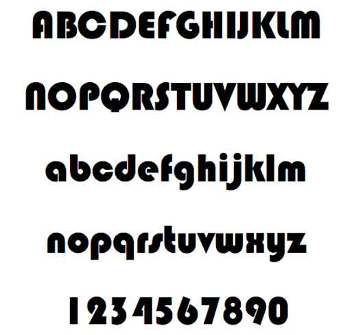
Bauhaus 93
Named for the famous design school, very dated, but elegant. Other, lighter versions exist.
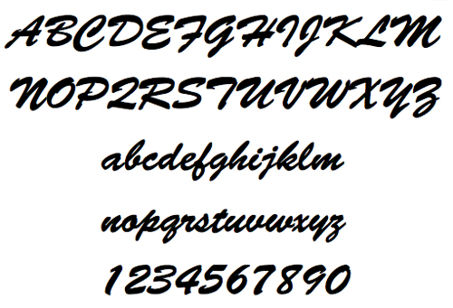
Brush Script Standard
Self-explanatory, it contains an "exuberant graphic stroke".
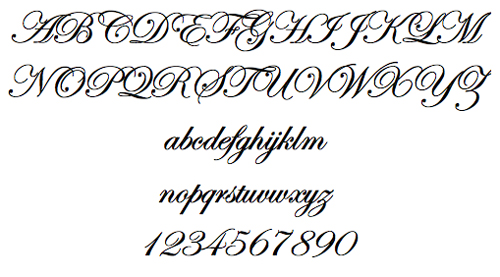
Edwardian Script
Much fancier than Brush Script.
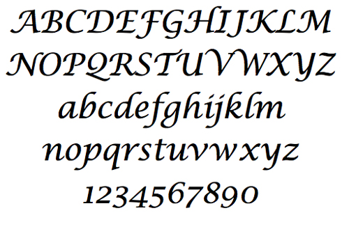
Lucida Calligraphy
Somewhere between the preceding two examples in terms of fanciness. Developed from Chancery Cursive.
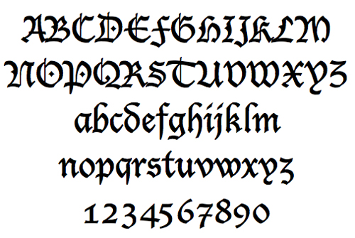
Lucida Blackletter
Some people call this style of type "Old English", or "Gothic", but both of those terms are used for other things (see the Century Gothic font above), so we'll stick with Blackletter. This is the style of font that Gutenburg used when he printed his first Bible. Very European, very Old Old School.
When you're sure you know all these fonts, try taking the test!