Dr. Seuss Kerning Problems
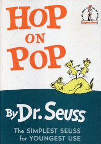
Hop on Pop
This is the book I've used to teach each of my four children to read. Once the kid has learned what each letter says (more or less), they're ready to decode text, and this is a fantastic book for a beginner. The illustrations are great, the text builds sequentially, reinforcing what the child learns from page to page, building to a delightful climax with Constantinople and Timbuktu.
However....it's a kerning nightmare. I don't know if it was originally set in metal type that didn't allow good kerning of capitals, or what the problem was, but if you sit and stare at these letters for fifteen minutes every day for three weeks (times four kids), you become keenly aware of how important good kerning is.
Pup is Up
The book starts off just fine-the Pup is Up, and the letters fit just fine.
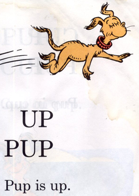
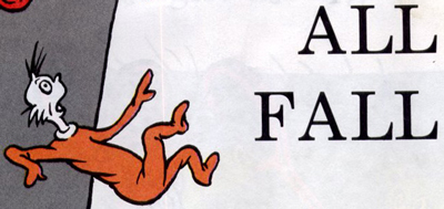
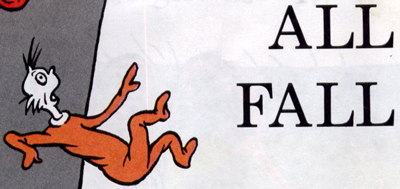
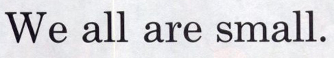
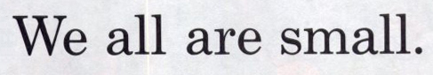
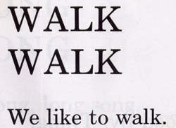
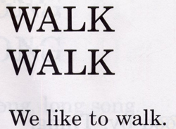
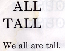
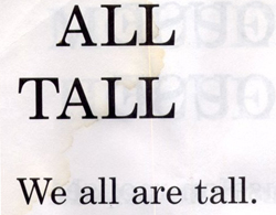
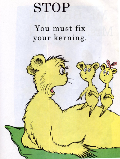
But this is due to chance, rather than design. All of these letters juts happen to fit together pretty well. Other times, we're not so lucky, especially with capital letters. See if you can find the differences between the top and bottom example of each image (some images have more than one kerning problem). The top one is the original, and the bottom one has had kerning corrected.
All Fall
We all are small
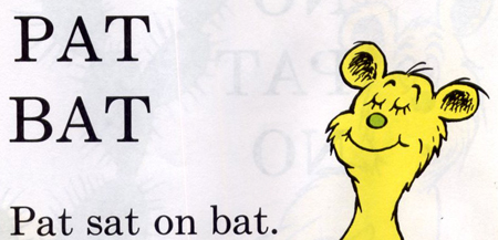
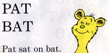
Pat sat on bat
WALK WALK We like to walk.
ALL TALL We all are tall.
Although kerning is often corrected "automatically" by the software, it's up to the designer to check for mistakes!
Bonus question: What's the font?